For years, WCAG 2.x has been the primary standard for measuring color contrast in digital products. Its well-known ratios such as 4.5:1 or 7:1 became almost universal rules across design and development teams.
However, the evolution of interfaces, variable typography, dark modes, and the need for truly perceptual accessibility have revealed an important limitation:
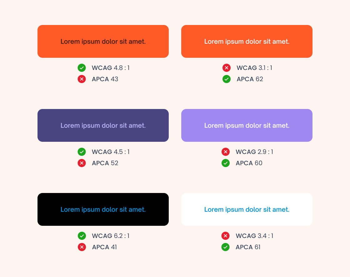
meeting WCAG 2 does not always mean text is genuinely readable.
This is where APCA (Accessible Perceptual Contrast Algorithm) comes in, the new approach shaping the future of visual accessibility and forming part of the transition toward WCAG 3.
The problem with contrast in WCAG 2
The current WCAG 2 model:
- Uses a fixed mathematical ratio between colors.
- Does not account for font size or font weight.
- Treats light-on-dark the same as dark-on-light.
- Can approve combinations that are difficult to read in practice.
This creates a common scenario in many digital products:
Interfaces that are “accessible on paper,” but not necessarily comfortable for real people.
What changes with APCA
APCA introduces a fundamental shift:
moving from a mathematical measurement to a perceptual measurement.
Instead of ratios like 4.5:1, APCA uses a scale called Lc (Lightness Contrast) that:
- Is based on how the human eye actually perceives contrast.
- Considers font size, font weight, and polarity.
- Enables different rules depending on the text type.
- Aligns with the future direction of WCAG 3.
The result is simple but powerful:
APCA measures real readability, not just technical compliance.
Why this is critical for Design Systems
For teams building Design Systems, the impact is immediate:
1. It redefines color tokens
It is no longer enough to “pass 4.5:1.”
Colors must now ensure comfortable reading within real typographic contexts.
2. It improves real product accessibility
Adopting APCA means:
- Less hard-to-read text.
- Better experiences in dark mode.
- More inclusive interfaces for users with low vision.
3. It prepares organizations for WCAG 3
APCA is not a passing trend.
It is the foundation of the next accessibility model coming with WCAG 3.
Adopting it early reduces:
- Technical debt
- UI rework
- Future compliance risk
WCAG 2 vs APCA in one sentence
WCAG 2 measures contrast.
APCA measures readability.
And in user experience, that difference changes everything.
Conclusion
Digital accessibility is entering a new era. We are moving from static rule-checking toward designing experiences that can truly be read.
Adopting APCA today does not mean abandoning WCAG 2 immediately, it means:
- understanding its limitations
- improving the visual quality of products
- preparing for the standard that is coming
Because in accessibility, the real goal was never to pass a test.
The real goal has always been that people can read.