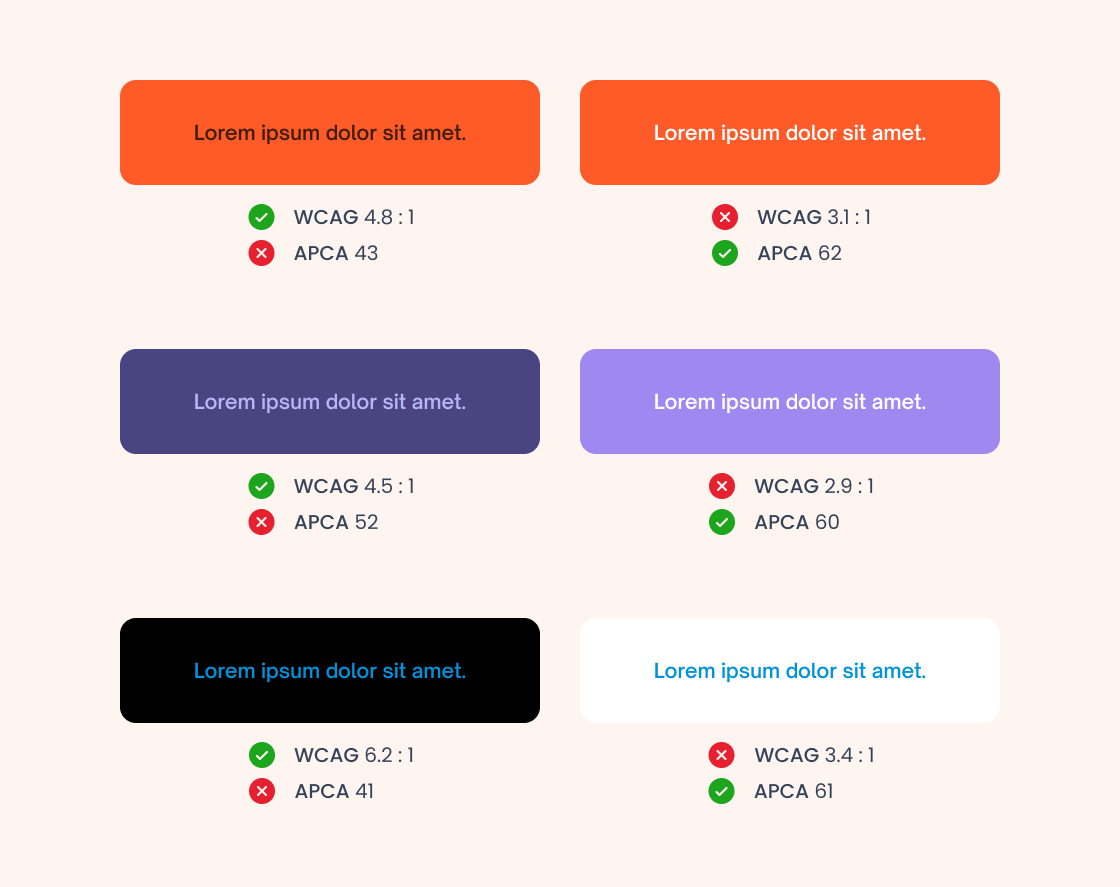
For years, WCAG 2.x has been the primary standard for measuring color contrast in digital products. Its well-known ratios such as 4.5:1 or 7:1 became almost universal rules across design and development teams. However, the evolution of interfaces, variable typography, dark modes, and the need for truly perceptual accessibility have revealed an important limitation:meeting WCAG […]
Tag: Web Design
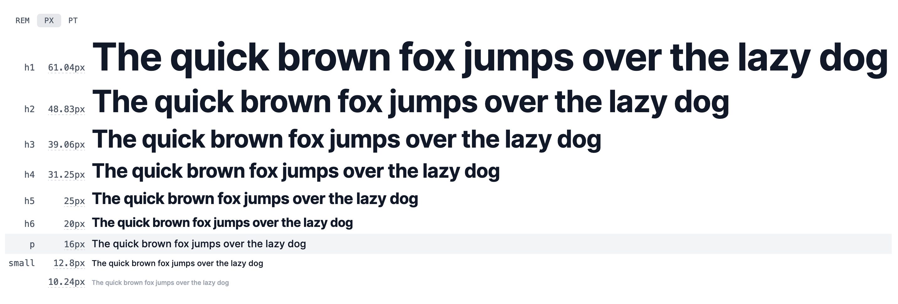
Typographic Scales in Design Systems
In the world of graphic design, choosing the right typographic scale is critical to creating a consistent and engaging user experience. In this article, we will explore the most common typographic scales used in web and mobile applications and how to apply them in design systems. There are several typographic scales used in web and […]